
Harvest Coffee House - Brand Identity
Harvest Coffee House
Brand Identity
Harvest Coffee Shop is a conceptual brand identity project created for a small-town coffee shop rooted in agriculture, community, and slow living. Located in a rural farming town, Harvest Coffee Shop was designed to feel like a gathering place where locals could start their mornings, farmers could stop in after sunrise, and visitors could experience the warmth of Midwest hospitality.
The goal of the project was to create a visual identity that felt handcrafted, welcoming, and deeply connected to the rhythms of rural life while still appearing modern and memorable.
Client: Harvest Coffee House
Scope: Brand identity and logo system
Role: Brand Designer / Visual Designer
Timeline: 2-3 weeks
Tools: Adobe Illustrator and Photoshop
The Challenge
Many independent coffee shops lean heavily into urban minimalism or trendy aesthetics. Harvest Coffee Shop needed a brand identity that felt authentic to its rural environment without appearing outdated or overly rustic.
The challenge was to balance:
Traditional agricultural influences
Modern coffee culture
Small-town warmth
A polished, professional visual system
The identity needed to appeal to both longtime residents and younger customers seeking a cozy, community-centered café experience.
The Strategy
Brand Personality
The Harvest brand was built around four key traits:
Warm
Honest
Grounded
Community-Driven
The coffee shop was positioned as more than a café – it became a daily ritual and social hub for the town.
Target Audience
Residents and farming families
Young adults and students
Travelers passing through rural Ohio
Remote workers seeking a relaxed atmosphere
The brand messaging, the client, and I wanted something simple: “Gather. Sip. Stay awhile”.
The messaging emphasizes comfort, conversation, and connection to the land.
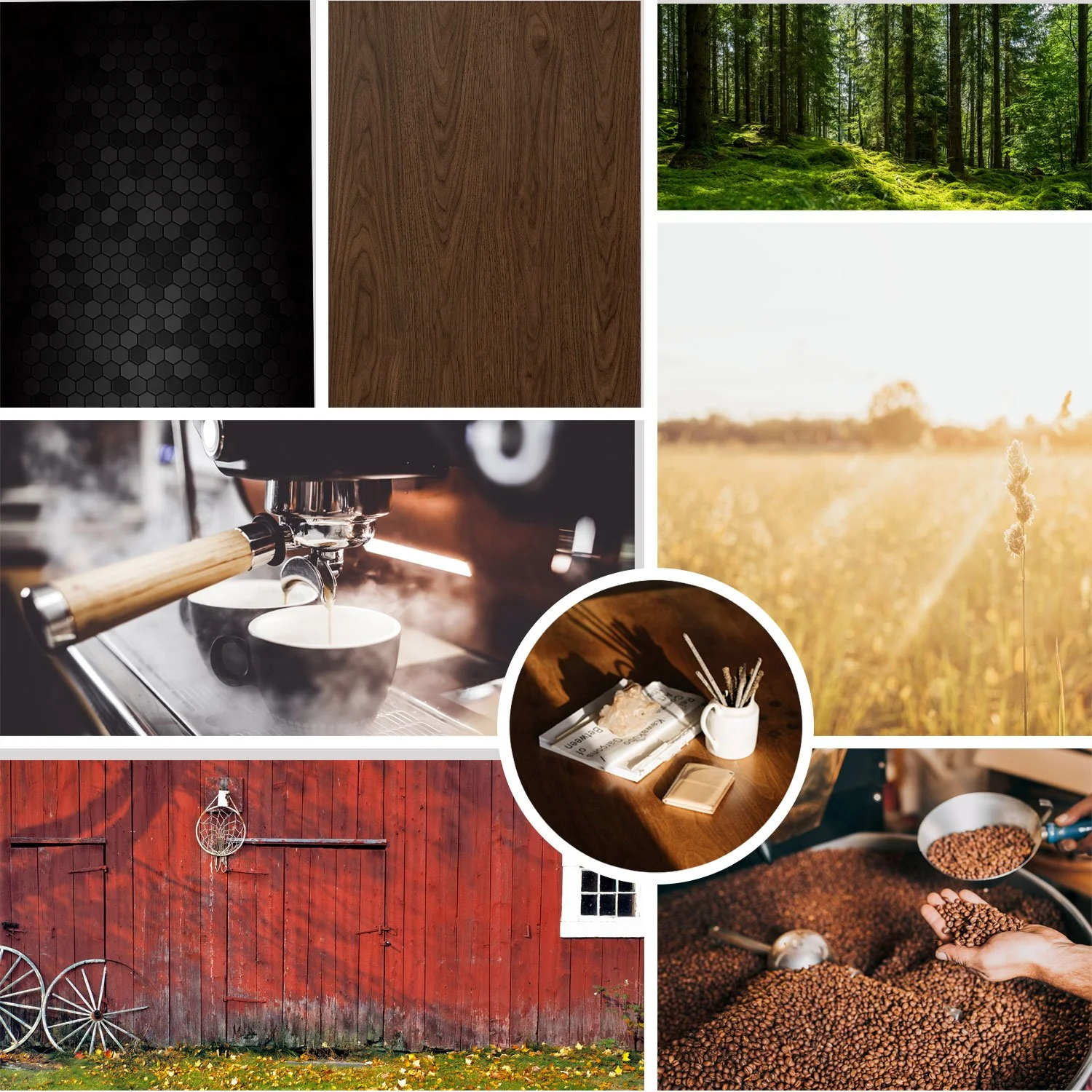
Visual Identity
Logo Design
The logo system combines agricultural symbolism with clean typography. Inspiration came from:
Wheat stalks
Sunrises over farmland
Vintage grain signage
Handcrafted café branding
The final mark features a simplified wheat emblem paired with an approachable serif word mark, creating a balance between rustic charm and modern sophistication.
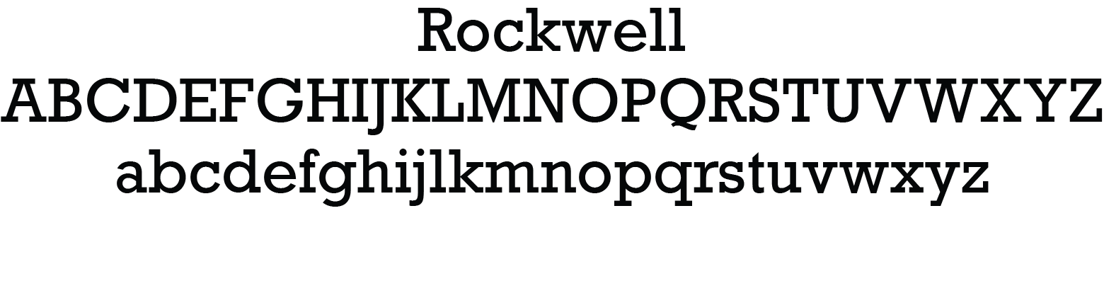
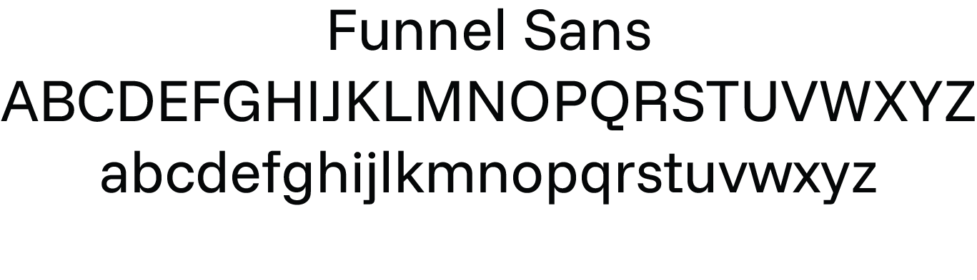
Typography
The typography system combines:
A classic serif font for warmth and heritage
A clean sans-serif font for readability and modern contrast.
This pairing helps the brand feel timeless while remaining versatile across packaging, signage, and digital platforms.
Color Palette
The palette was inspired directly by the surrounding landscape:
Warm cream
Soil brown
Wheat gold
Deep evergreen
These tones reinforce the organic and grounded personality of the brand while creating a cozy café atmosphere.


Design Outcome
The final identity system successfully created a coffee brand that feels deeply rooted in small-town farming culture while remaining clean, modern, and adaptable. Harvest Coffee Shop stands as a brand built on simplicity, authenticity, and community connection — proving that thoughtful design can elevate even the quietest rural spaces into memorable experiences.
Let’s build something great.
Click the button below to get started!