
Bourbon Barrelhouse - Brand Identity
Bourbon Barrelhouse
Brand Identity • Restaurant Experience
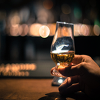
Bourbon Barrelhouse was built around a feeling I kept coming back to: the polish of a city whiskey bar with the ease of a place that already knows your order.
I wanted the brand to feel rich and elevated without tipping into something stiff or overly formal. The sweet spot was warmth with intention—the kind of atmosphere that invites people to settle in, order one more round, and stay longer than they meant to.
Client: Bourbon Barrelhouse
Scope: Brand identity and logo system
Role: Brand Designer / Visual Designer
Timeline: 2-3 weeks
Tools: Adobe Illustrator and Photoshop
The Challenge
The heart of this project was balancing two ideas that don’t always play nicely together: upscale and familiar.
The restaurant wanted the atmosphere of a sophisticated bourbon bar you’d find in a larger city, but it also needed to feel grounded and welcoming—more like a favorite local spot than a place saved only for special occasions.
My challenge was translating that emotional contrast into a visual system that felt confident, warm, and memorable from the first impression.
The Strategy
I built the concept around the idea of “coming home to good taste.”
Instead of leaning too hard into obvious whiskey imagery, I focused on the rituals and textures that make bourbon culture feel timeless: aged wood, conversation, craft, and depth.
That led the design direction toward:
layered wood-toned neutrals and deep charcoals
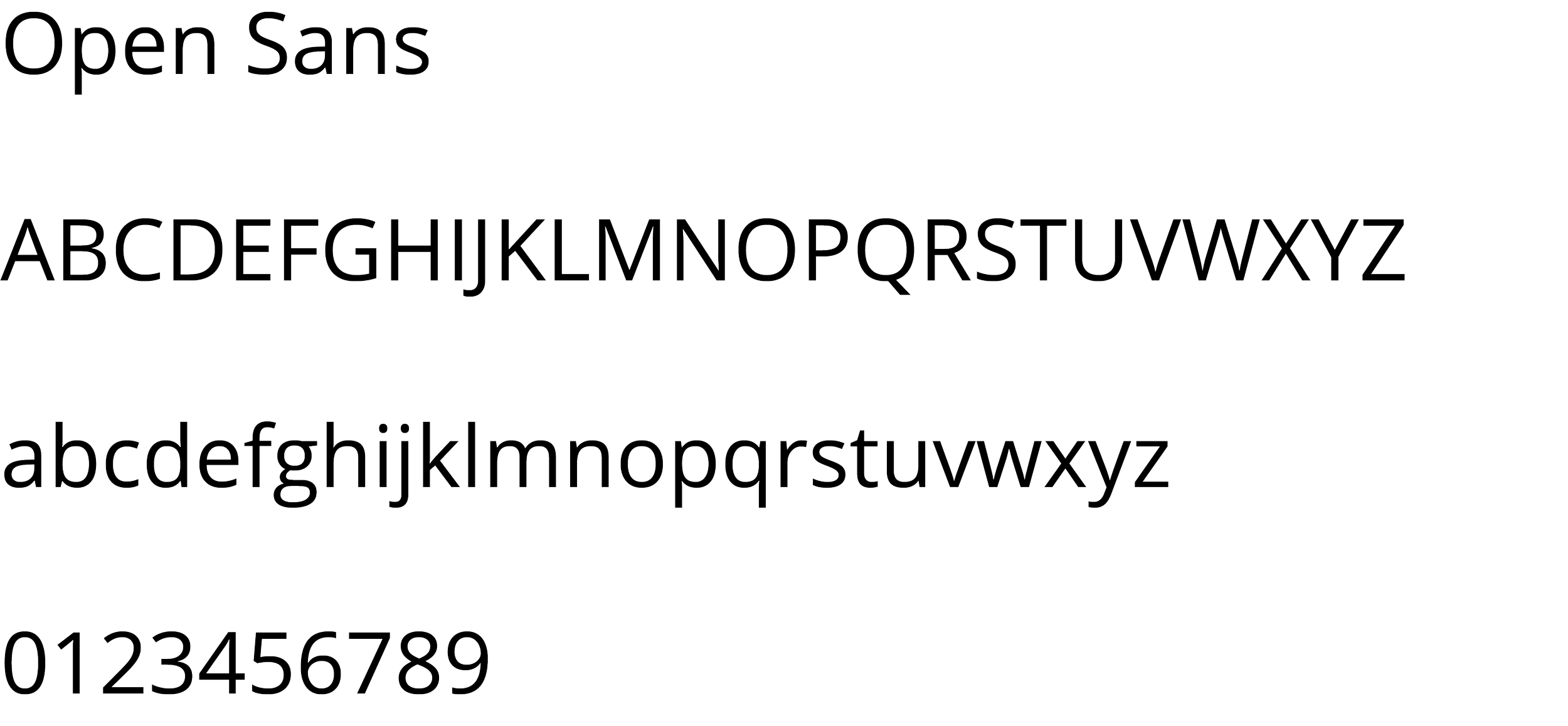
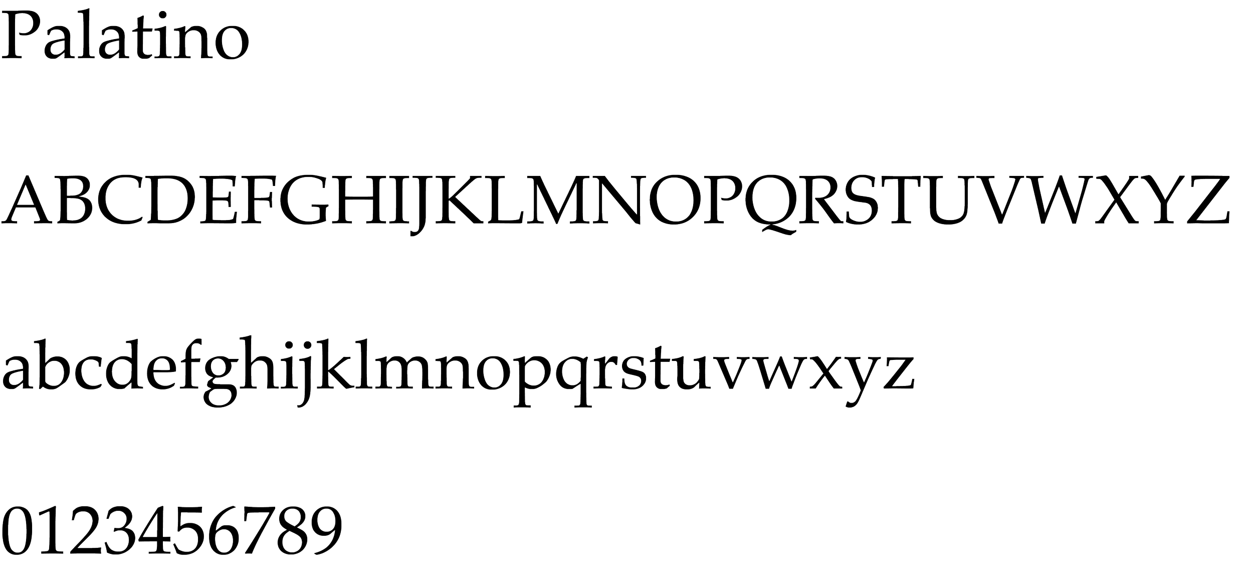
classic typography with a heritage feel
clean, intentional layouts that keep the brand elevated
tactile details that feel crafted rather than decorative
The goal was simple: every touchpoint should feel like an extension of the atmosphere inside the space.
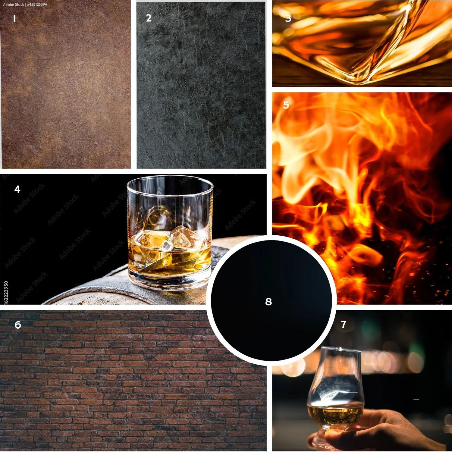
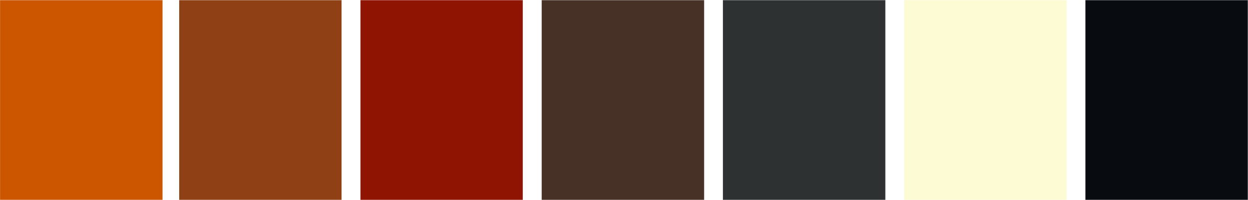
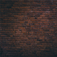
Color & Material Inspiration
The palette pulls directly from the sensory side of bourbon: oak, caramel, smoke, leather, and warm low light.
I wanted the colors to create atmosphere before a guest even reads a menu. The deeper tones bring weight and richness, while softer neutrals keep the system from feeling too heavy.
These choices also translate naturally across print finishes, signage, and in-space branding moments.
The Outcome
The final identity gives Bourbon Barrelhouse a presence that feels polished, warm, and distinctly memorable.
It captures the sophistication of a destination whiskey bar while keeping the familiarity of a local gathering place - the kind of balance that makes people want to come back.
More than anything, this project proves how much brand perception lives in the details: the spacing, the texture, the tone, the feeling of being welcomed before the first drink is even poured.
Let’s build something great.
Click the button below to get started!